
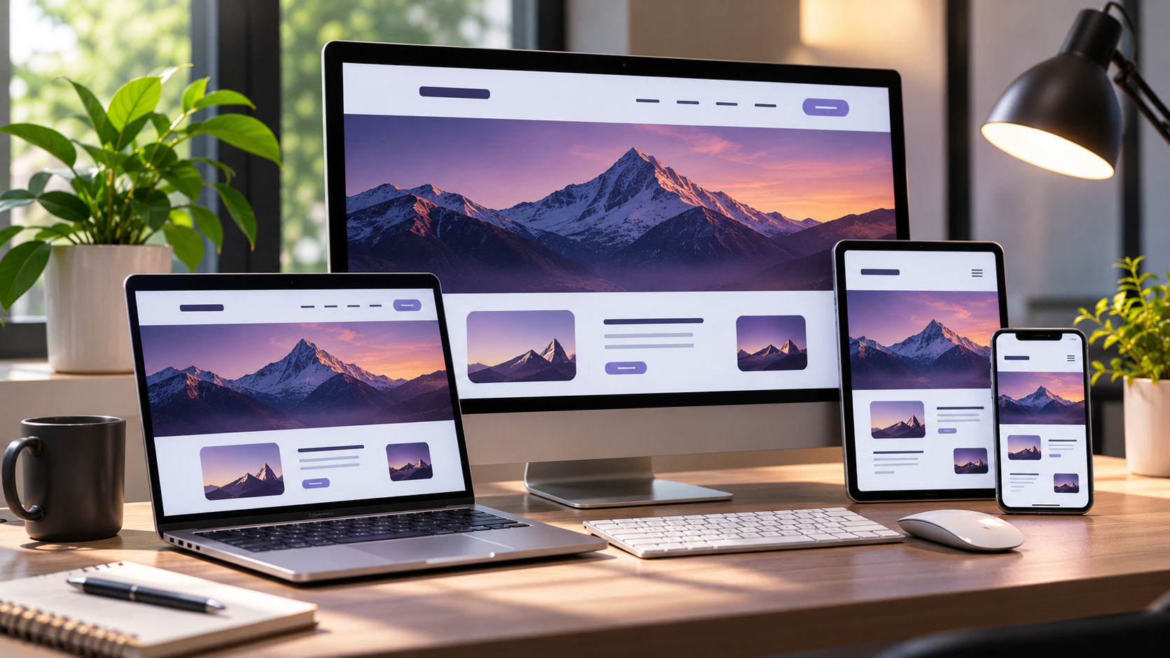
The web design industry is developing rapidly day by day. Companies and individuals who keep up with this pace and continuously improve their designs will always stay one step ahead. We have prepared this article to help you keep up with these developments and improve your designs.
Until recently, it was widely believed that bright colors on websites attracted users more quickly. However, in recent years, these vibrant designs have gradually given way to simpler layouts. With these web designs, which are simple and minimal yet more effective at capturing attention and sparking curiosity, you can achieve the results you desire.
Flat Design

Flat Design is a trend we have heard about many times in recent years and has become one of the defining design styles of today. This style consists of simple, clean, flat, easy-to-understand elements without visual effects.
Today, simplicity and minimalism are widely accepted as the defining characteristics of Flat Design. Its popularity as a modern trend was further confirmed when Apple adopted it with iOS 7, following Microsoft Metro UI.
Flat Design is now everywhere. The fact that mobile devices are also being designed around this trend encourages designers to follow the Flat Design approach. However, its simple and flat appearance should not give the impression that Flat Design lacks character. On the contrary, Flat Design is a style that captures user attention and sparks curiosity.
Here are a few examples of major companies that have updated their logos using Flat Design:


Responsive Design
With the growing use of mobile internet, responsive design has become essential. However, a website does not need to have separate mobile versions under a subdomain for search engines, in addition to its main domain. This is because future Google updates may not favor websites that maintain two separate versions: a standard website and a mobile website.
For this reason, creating a website with responsive web design using a single URL is a much healthier approach. Mobile website visits around the world are expected to increase even further in the near future. In 2015, it was predicted that mobile usage would surpass desktop and laptop computer usage. Therefore, a significant increase in responsive websites was anticipated.

